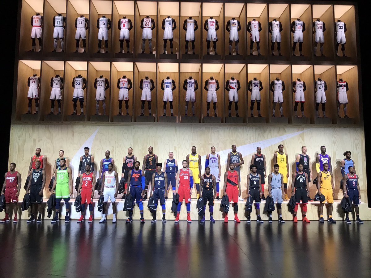
On September 15th, the NBA released the newest set of alternate uniforms for this upcoming season. Here are all thirty jerseys ranked from worst to best.
Golden State Warriors
The Golden State Warriors may be the defending champions, but these are the worst of the alternate uniforms. I understand the whole “Welcome to Oakland” sentiment, but with the color scheme the Warriors have, I expected a lot more out these jerseys. I also can’t help but feel like “The Town” is a sad attempt to copy Cleveland’s “Defend the Land” slogan.
Utah Jazz
I mean do I really need to discuss these?
Los Angeles Clippers and Chicago Bulls
These are two jerseys that we saw these teams play in last season. While they aren’t the eye sore like other teams (cough Utah Jazz), these jerseys do lack a lot of creativity considering these teams are in two of the top three cities, in terms of market size. I would have thought these teams would jump at the idea of creating something truly unique for fans to get excited about.
San Antonio Spurs
https://twitter.com/DejounteMurray/status/908889629457182721
The San Antonio Spurs have never been known as a flashy NBA team. They have a simple color scheme and play an ‘old school’ style of basketball. These jerseys reflect that lack of flashy creativity that they are known for. Moving the number and logo slightly to the side isn’t going to impress me.
Minnesota Timberwolves
The Minnesota Timberwolves went with jerseys that are NOTHING like the San Antonio Spurs’, but I don’t think these are much better. Maybe it is my inner Green Bay Packer fan that is seeing the Seattle Seahawks’ colors, or maybe I am a normal person that thinks that is WAY too much neon green. Either way these jerseys are pretty bad.
Houston Rockets
https://twitter.com/HoustonRockets/status/909080791564607489
Look, there just isn’t anything going on here. Sure, the fancy red lining on the collar is cool, but is that really the best Houston could come up with? This franchise has had uniforms in the past that were wicked cool, but this is disappointing.
Memphis Grizzlies
https://twitter.com/memgrizz/status/909181780678279175
Similar to Houston’s jerseys, the Memphis alternatives feature one lone yellow stripe down the side. I like the logo on the shorts, but these jerseys lack flair, and the blue looks boring and depressing.
Miami Heat, Portland Trail Blazers, and New Orleans Pelicans
https://twitter.com/MiamiHEAT/status/908871029673517058
https://twitter.com/Hooligan_nba/status/909078533531725825
Aside from white versus black text, I see very little difference between these three jerseys. I am not a fan of uniforms that feature more bold colors as the main color of the uniform (see the Timberwolves ranking). However, red is a lot more tolerable than the blue from Memphis and green from Minnesota. I guess shoutout to Portland for having a stripe?
Indiana Pacers
I know I ripped the Utah Jazz for having literally the same color scheme, but I actually like the logo and number layout of these jerseys. Obviously this doesn’t mean I would wear these jerseys, but on paper they look pretty cool.
Brooklyn Nets
https://twitter.com/Hooligan_nba/status/909073296225968129
The Brooklyn Nets are in a similar situation as the San Antonio Spurs in terms of having little creative potential with the colors of the team. I liked that the Nets kept things simple and didn’t make a sad swing at trying to be creative like the Spurs did. The one issue that I have with these jerseys is the BKLYN. At first glance, it looks like ‘Booklyn.’ Just saying.
Charlotte Hornets
https://twitter.com/hornets/status/908889020163379201
Not quite sure why Kemba Walker could possibly be smiling all over Twitter in that uniform, but I do give the Hornets some credit for trying to mix things up with their alternate uniforms. The Jordan brand for the logo is also pretty sweet.
Atlanta Hawks
I remember watching the Boston Celtics with my dad when they played Atlanta while the Hawks wore these jerseys. He commented on how ugly they are, but I actually like these. I know I have been harsh on a lot of these alternates so far, but I am starting to get towards the sets I enjoy, so prepare for some nicer thoughts from me. I am not crazy about the colors, but I really like the pattern on the jerseys that give them a seemingly ‘layered’ effect.
Sacramento Kings
https://twitter.com/SacramentoKings/status/908866840394215425
At first, I was torn between the Kings and the Hawks in terms of ranking these jerseys. However, I really like the way the Kings included a similar pattern as the Hawks, but in such a way that my eyes don’t hurt when I look at them.
Washington Wizards, Toronto Raptors, and Orlando Magic
All three of these teams featured these jerseys last season. I like that none of them are too crazy and are unique rather than flashy. Shoutout to the Orlando Magic for being the only alternate jersey with pinstripes!
Boston Celtics and Los Angeles Lakers
https://twitter.com/Kgotsofalaang/status/909275397069709312
I am glad that the two teams in the NBA with the least changed jerseys over the course of each franchise’s history decided to keep it simple. That being said, I am a little jealous that the Lakers elected to not have a sponsor on their jersey, unlike the Celtics. To me, as both a fan of the league and the Boston Celtics themselves, I hate the GE logo, as I think it takes away from such classic jerseys.
Philadelphia 76ers
On one hand, I can’t help but feel like the 76ers were that kid in class who needed to turn in the homework at 11:59pm and waited until 11:55pm to start. On the other hand, I think that these jerseys are unique in terms of both the font and the stars on the shorts and sides of the jersey. I truly think the 76ers are going to make some big strides (for them) this season, and what better way to do it than in some pretty good looking alternate uniforms?
Dallas Mavericks and Denver Nuggets
Yes, I do see the Denver Nuggets jersey, and yes, I do know it looks just like the Utah Jazz and Indiana Pacers. However, the feature I really like about these jerseys is that they feature the skyline of their respective cities. I think that is a really unique feature that pays homage to where these teams are from. Both are in fairly small markets, and this is a great way to connect with each team’s respective cities.
Phoenix Suns
https://twitter.com/Suns/status/908881403001004034
The Phoenix Suns will be a bottom team this season and will be losing a lot. However, at least they will be doing it in style. I love the orange/purple outlining of these jerseys. The font and font design is also really unique. I am actually excited to see these jerseys in action this season.
Detroit Pistons
The Detroit Pistons are actually in my top-5 for alternate jerseys for this upcoming season. I like that they kept things simple with the color, name, and logo. At the same time, the Pistons were also able to make their jerseys pop with deep blue accented by red. The logo on the shorts is perhaps my favorite out of the ‘new’ logos that have been featured on the alternate jerseys.
Milwaukee Bucks
I am definitely a fan of the jerseys the Milwaukee Bucks have as their alternate uniforms. I like the number placement in relation to the logo, as well as the details of this jersey. For example, the blue on the shorts is the same blue that outlines the court. Both are an attempt to pay homage to Lake Michigan, which is just blocks from the BMO Harris Bradley Center.
Cleveland Cavaliers
Okay, tell me these Cavalier jerseys aren’t awesome. Whether it is the color scheme or the logo/number, these jerseys will most likely be big hits in ‘The Land.’
New York Knicks
https://twitter.com/Hooligan_nba/status/909073609175584768
I am a huge fan of the alternates for the New York Knicks. I love that the city name and jersey number have so much detail put into it, being surrounded by white, which is surrounded by blue. I could easily see these jerseys being a modern day classic and something the team could/should use for many years to come. To be in the largest market in basketball can sometimes make teams less likely to care about their products because they know people will buy them, but the New York Knicks did a great job with these.
Oklahoma City Thunder
https://twitter.com/Hooligan_nba/status/909069457804455937
I don’t care who you root for; these are clearly the best alternate jerseys in the NBA right now. Not only do they look wickedly awesome because of Paul George wearing them, but they also look super badass! I like that the Thunder didn’t go crazy with some solid orange uniform like they have in the past, but elected to go for a deep blue with light blue accents on the jersey. The orange number plays really well with the blues and make this jersey a must-have for NBA fans that don’t even follow the Thunder!
What do you think of my rankings? Which are your favorites? Let me know in the comments or start a new thread on our Discuss page!


