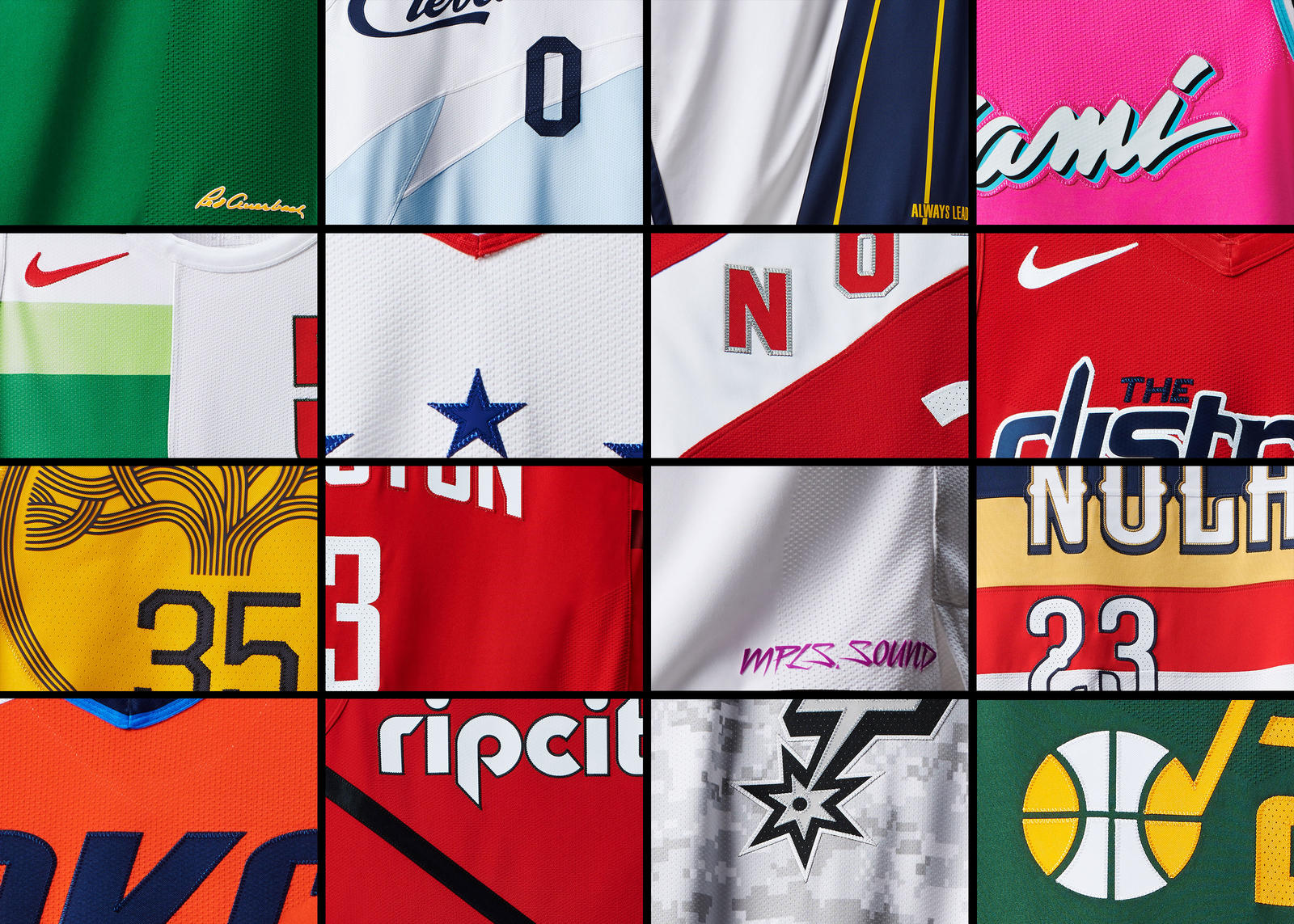
Nike released the newest NBA Earned Edition jerseys Wednesday, and there are some that are definitely better than others. I have organized these sixteen new uniforms into four tiers.
Tier 4:
Miami Heat, Milwaukee Bucks, Minnesota Timberwolves, Utah Jazz
Miami Heat: They say “real men wear pink.” The jersey is supposed to capture the nightlife of south beach, but these jerseys are an eyesore to look at. The design of the uniform is too simple to compete with the overly vibrant colors used.
Milwaukee Bucks: These uniforms are grossly asymmetrical and the the arrangement of the sectioned colors, team name, number, and logo looks extremely discombobulated. No offense, but it looks like something someone waited to design until the last day and then slapped this together at 11:58 to turn in before midnight.
Minnesota Timberwolves: These uniforms were designed to honor the late and great Prince, and while I love Prince as much as the next guy, I don’t think the Minnesota Timberwolves needed to involve themselves with a color scheme that ultimately has nothing to do with basketball. I love the idea, but I do not love the execution.
Utah Jazz: The Jazz are such a fun team and have a lot of promise for their franchise with Donovan Mitchell. Unfortunately, these uniforms are about as exciting as the night life in Salt Lake City. The uniforms were designed to honor past uniforms, but every other team went with, at the very least, a creative design and these look like the Jazz are still stuck in the early 2000s.
Tier 3:
Toronto Raptors, Washington Wizards, Houston Rockets, Portland Trail Blazers
Toronto Raptors: The Raptors went for a design to honor their Canadian heritage. However, these jerseys look pretty unoriginal and kind of like high school track uniforms. We get it, Toronto, you are very far north. But what else do you have for us? You can’t be trendy and original if you are going to go with such boring jerseys when you have a fun, exciting team that literally has a dinosaur for a mascot.
Washington Wizards: I have similar complaints for these as well. The Washington Wizards literally did nothing with these jerseys other than telling us they are specifically from Washington D.C. Your team is literally named after sorcerers and these uniforms are ironically missing any kind of magic to them.
Houston Rockets: The Rockets uniforms look like there was literally zero thought or fun put into them. They are not eyesores like the uniforms from tier 4, but there was so much Houston could have done with these.
Portland Trail Blazers: We get it, Portland; you’re minimalist, you’re trendy, you’re hipster, but are you still going to ride with a slogan you have been using for forever for your team’s uniforms. I think Rip City is a cool nickname, but if I am a fan, I look at these uniforms and see no difference between this and any of their other alternate jerseys. From a marketing standpoint, I find these jerseys boring and unimaginative for a team in such a quirky and crazy city.
Tier 2:
Boston Celtics, Philadelphia 76ers, Oklahoma City Thunder, San Antonio Spurs
Boston Celtics: The Celtics have always stuck with a fairly conservative, classic look. I have them in tier 2 simply because they did not create something disappointedly different from the norm, but it also isn’t anything special.
Philadelphia 76ers: The 76ers went for a similar vibe that Boston did; something the isn’t ugly to look at but also isn’t anything special. I wish there was something to honor the city on these uniforms, but it doesn’t stop them from being good jerseys.
Oklahoma City Thunder: The Thunder’s orange alternate uniforms are, again, similar to previous jerseys, but I think their twist is a bit disappointing. Just putting a little fissure in the letters isn’t enough to make these especially interesting.
San Antonio Spurs: These uniforms were designed to honor San Antonio’s military history. Previous camo jerseys in both the NBA and other sports have always been very bold. These jerseys are much like the Spurs, as they are a bit more subtle and not flashy despite the camo design.
Tier 1:
Cleveland Cavaliers, Indiana Pacers, Golden State Warriors, New Orleans Pelicans
Cleveland Cavaliers: The Cavaliers have had many uniforms in the history of their organization. These are unique and new. Designed to honor Lake Erie’s icy water, these uniforms are creative, easy on the eyes, and are at least something Cavalier fans can be excited about this season.
Indiana Pacers: The Pacers new uniforms offer a type of ‘sleekness’ that the other 15 uniforms seemingly can’t offer. The Pacers did not try anything over the top, but these uniforms still offer something different and unique for Pacer fans. They paid homage to their state’s history of car racing and their new style of basketball by adding the sleek element of “speed” to their uniforms. All of the jerseys in tier 1 are jerseys that will sell in high volumes in their respective markets. The new Pacers jerseys will be no exception.
Golden State Warriors: The Warriors took their team’s name literally and went for some gold jerseys. If you have a problem with the defending champions wearing gold jerseys, then I dare your team to step up and knock them out of title contention.
New Orleans Pelicans: The Pelicans are disadvantaged, having such a difficult mascot to model their team apparel for. That being said, these uniforms are still slick. The color design/location is good and it is clear the designers for these jerseys did not try to do too much with them. Sometimes less is more and the Pelicans jerseys are actually really cool despite the simple design.


