With another NBA season underway, the league has revealed its newest iterations of the NBA City Edition jerseys. All 30 NBA teams received one which begs the question: Which team has the best “City” edition jersey this year?
Below, we rank all the NBA City Edition jerseys, along with a link to where you can pick up your favorite jersey.


Ranking Every NBA City Edition Jersey 2024 (Best to Worst)
Elite NBA City Edition Jerseys
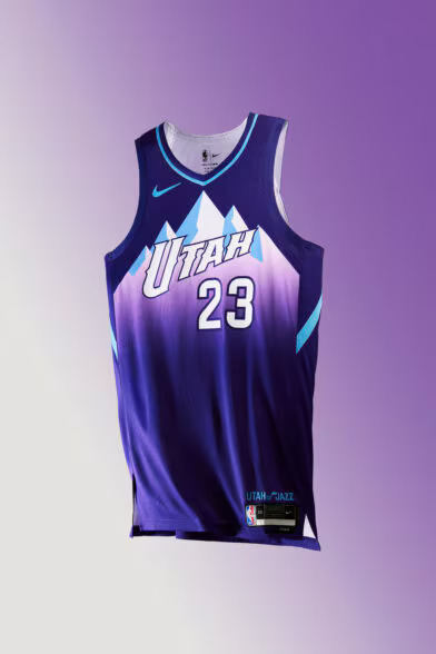
1) Utah Jazz
Plain and simple, there is no better jersey in basketball than the Utah Jazz’s purple mountain jerseys. Bringing this back for this season’s NBA City Edition jersey is incredible.
2) Toronto Raptors
Although Utah is the easy top pick, there are few jerseys as iconic as the throwback Toronto Raptors jerseys. This isn’t as good, but the throwback Raptor logo is one of the best in sports.
3) Orlando Magic
The jersey that was synonymous with Shaquille O’Neal and prime Dwight Howard is finally back. Another classic look that’ll never go out of style.
4) San Antonio Spurs
This jersey might not look the greatest, but the effort is there and the colors of the old Spurs logo are pretty nice. With a lot of “meh” or repeat jersey concepts this year, San Antonio’s is still near the top.
5) Portland Trail Blazers
“Rip City” is simple but timeless. Nobody pulls off a black jersey like Portland, and this year is no exception.
6) Boston Celtics
Although many may blast this pick, Boston did a good job doing something different with black and a highlighter green, while also keeping their classic colors as well. It gives off Oregon Ducks vibes and I am here for it.


Great NBA City Edition Jerseys
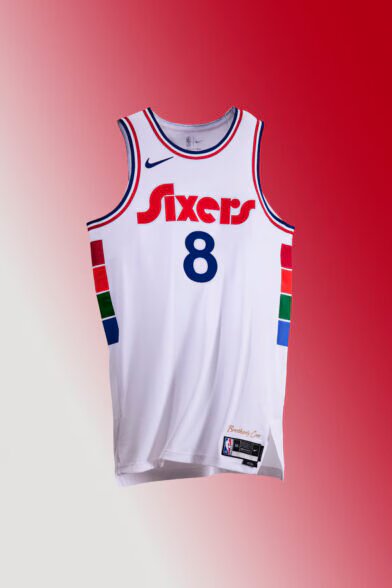
7) Philadelphia 76ers
Although Philadelphia just fell short of the “elite” category, it’s a take on a retro style and they pulled it off. Note to other teams: don’t try too hard and go back to retro looks and you’ll be fine.
8) Washington Wizards
Washington may have one of the more plain NBA City Edition jerseys, but the gothic font puts this jersey over the top. It’s another example that sometimes simple jerseys are the best.
9) Cleveland Cavaliers
This is completely out of Cleveland’s wheelhouse in terms of color scheme, but I am here for it. The blue along with the multiple styles that represent the Cleveland Museum of Art was a gamble but it paid off.
10) Charlotte Hornets
Although the Hornets have seemingly recycled these jerseys for a few years now, the jerseys are still clean. It may basically be another re-run, but when something isn’t broken, don’t fix it.
11) New Orleans Pelicans
The Mardi Gras theme isn’t flawless but it does actually represent the city unlike some of the other jerseys on this list. It’s a classic look and purple always looks good in basketball.
12) Detroit Pistons
Although I would’ve liked to have seen a 1990s or early 2000s throwback from Detroit, the cream jerseys with basic cursive font is a solid option.


Mid NBA City Edition Jerseys
13) Phoenix Suns
Phoenix attempted a little bit of a throwback vibe with their jerseys, but it didn’t quite pay off. With that in mind, there clearly is an effort and the tribal pattern on the side is a great touch.
14) Oklahoma City Thunder
Although it shouldn’t work, Oklahoma City’s black jerseys with highlighter accents are simple and nice. It’s nothing special, but it’s certainly not bad.
15) New York Knicks
If the New York Knicks didn’t already have a great look, this jersey would be much lower. With that in mind, the two-tone New York across the middle is a good look without sacrificing the timeless color scheme.
16) Brooklyn Nets
Once again Brooklyn tried to introduce different lettering and a design that didn’t quite hit the mark. It’s hard to not look at this one as a dud with some of their jerseys being huge successes in the past. It’s not bad though and there was at least an attempt to bring out the culture of Brooklyn.
17) Minnesota Timberwolves
I’ve got my eyes on you Minnesota. Although the look is solid, this is the second year in a row the Timberwolves have basically had the same uniform. Let’s get creative again.
18) Sacramento Kings
The Kings are another team that tried to pay tribute to their history. Unfortunately, this one kind of falls flat, but it gets style points for the effort and history behind it.



Bad NBA City Edition Jerseys
19) Milwaukee Bucks
For a team that has one of the best retro color schemes in sports, the Milwaukee Bucks love using blue for whatever reason. It doesn’t work and they need to stop trying.
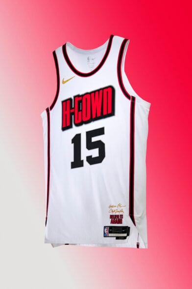
20) Houston Rockets
Houston tried this year, but the “H-Town” font looks like something out of a comic book. With nothing else of note on the jersey, this one feels like a letdown.
21) Atlanta Hawks
Much like many other teams in the NBA, the Atlanta Hawks had some great throwback options to sample from, but they decided to go off the rails instead. The jersey is plain as it is and the powder blue stripes just feel wrong for Atlanta.
22) Chicago Bulls
Did the Bulls actually try? With a great Chicago city flag in play, the Bulls decided to go towards a very plain look accented with gold. Chicago has to win a lot more if they want to be able to pull that off.
23) Dallas Mavericks
While the script and font for these jerseys are timeless, this jersey is simply way too plain. Did the designers go on strike halfway through?
24) Denver Nuggets
We get it, you’re a mile above sea level. Does the City of Denver not have anything else going for it? The color splash is a nice try, but it has nothing to do with the team and feels like it was colored in on a kid’s menu at a TGI Friday’s.


Straight Garbage NBA City Edition Jerseys
25) Indiana Pacers
I give credit to the Indiana Pacers because they tried. Granted, their attempt was to try to make a jersey that looked like it was drawn by a child, but it was an attempt to be fair. The colors between the lettering and the sides is weirdly different and outside of the color, it’s a very boring jersey.
26) Golden State Warriors
With all that Golden State had in their arsenal, a basic jersey like this is all they could come up with? I don’t even hate it, but this jersey makes me feel literally nothing.
27) Memphis Grizzlies
Memphis was shooting for something different here and it just doesn’t work. The color red and the Grizzlies just don’t mix. If they used red as an accent color that could work, but certainly not as the main one. For as bad as the Grizzlies look in red, the font is elite.
28) Miami Heat
The NBA should’ve sent this one back to Miami to be redone for the second year straight. Just adding “culture” after your team name when your franchise hasn’t won a title since gay marriage was legalized is certainly a choice.
29) Los Angeles Lakers
Congrats Lakers, you have a timeless logo, a great color scheme, and you decided to phone it in with a nickname nobody calls you anymore and no visible changes. Please try next time.
30) Los Angeles Clippers
What the hell is this? Seriously, the lettering looks like it was made by a fourth-grader who just learned how to use clip art. The coloring isn’t exactly anything to write home about either. It would appear Steve Ballmer needs to start putting some of his cash into their creative department.
See a jersey you like? Make sure you get your NBA City Edition jersey to wear before it’s too late! (it’s a great Christmas gift)


